Oxfam
Digital illustrations inspired by Where’s Waldo made for an animated video on the difficulties of finding childcare.
Role
Illustrator
Agency
Point Blank Creative
Client
Oxfam
Date
December 2023

Oxfam is on a mission to make the federal government understand that universal childcare is crucial for families across Canada.
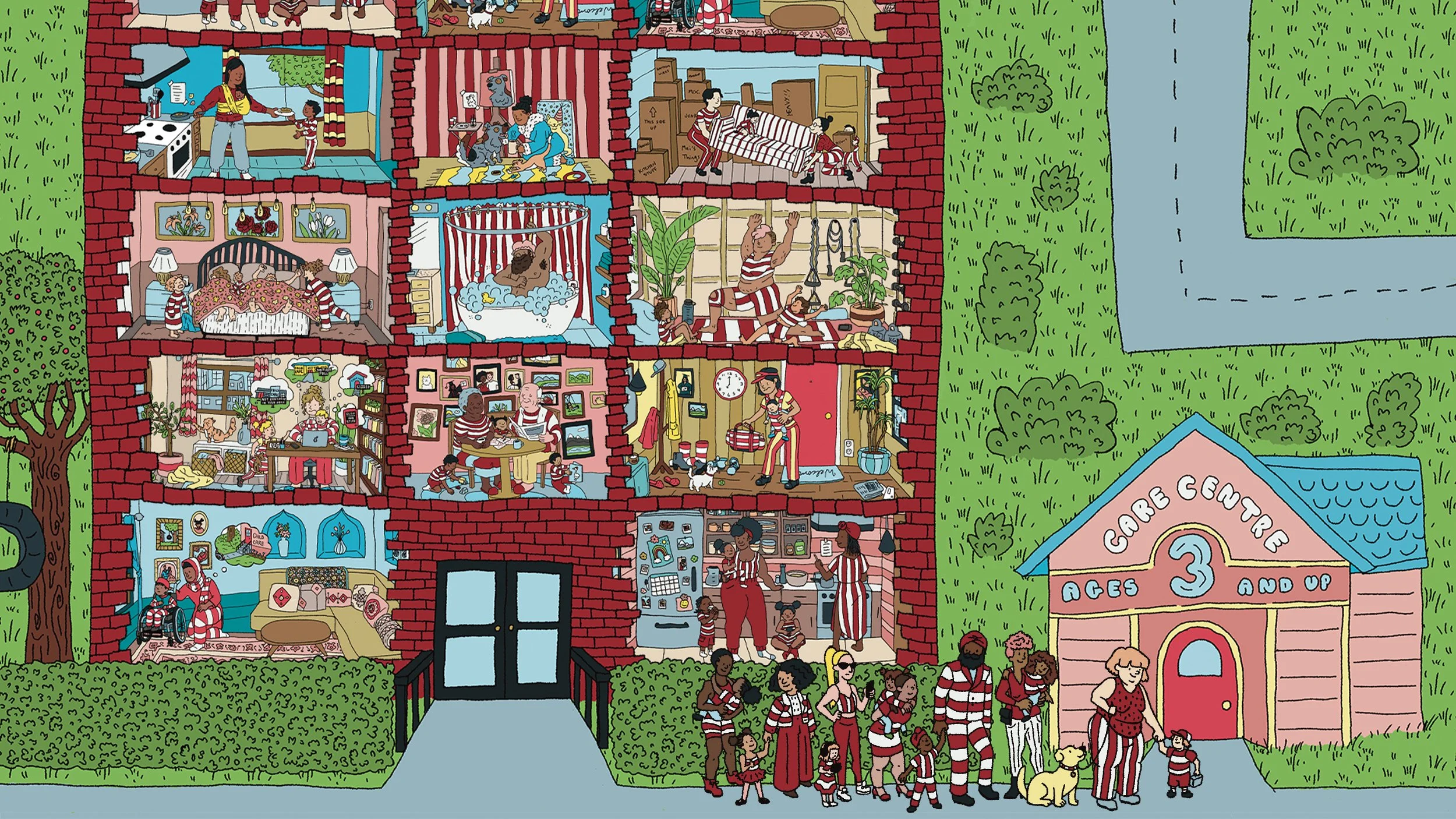
Using Procreate, I created a series of illustrations centred around unique family situations. The style is pulled from the pages of Where’s Waldo with cartoonish features and textured outlines. It was incredibly fun to play with the proportions, patterns, and details necessary to give it the Waldo vibes without cluttering the compositions to the point of being unrecognizable.
The Point Blank Creative team directed me on the type of scenes they’d like to see, allowing me to fill in any blanks after the core demographics were represented. It was a great back-and-forth between the team and me that was refreshingly fast given the quick turn around time. The entire project was done in one month which, for thirty images, is a pretty tight timeline but it’s doable when you’re working with the right people!

The animation of this video, creative direction, and copywriting was done by the internal team at Poink Blank Creative.

The three digitally printed rooster illustrations needed to represent their individual breeds accurately while also differentiating each wine varietal on the shelves. The ornate crests of the birds serve to separate the roosters as well as bring depth and drama to the labels.
We wanted to convey a fast food worker on a rush to get their child to a distant daycare and the limited hours/staff of that daycare. This was a fun one to compose and balance. I pulled in pieces that I remember from daycare experiences like ‘quiet coyote’ and toys that I’m familiar with.
Here we see the chaotic life of the fast food worker with mail waiting for them, a dog wanting to play, and strewn shoes. She’s just starting her day and this scene allowed us to establish the time for the rest of the video.
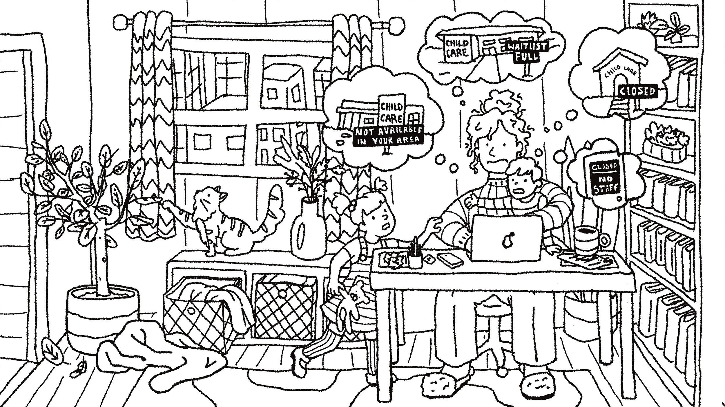
The home office scene was incredibly relatable to me so I found this one the easiest to put together. I basically made my home life with the cat and plants but added kids to add to the stress of the workday.
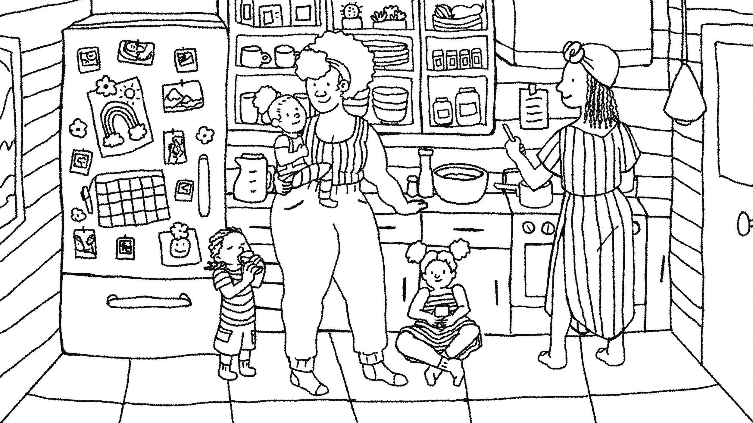
This scene was so fun to compose. Everything from the exposed shelving to the decorated family fridge not to mention being able to show a queer, body-positive family of colour was an absolute joy to create.
The Persian designs and decor in this image were perfect to add that extra bit of detail to match the Waldo style. The characters are dressed in recognizable Middle Eastern attire to ensure that demographic felt represented.
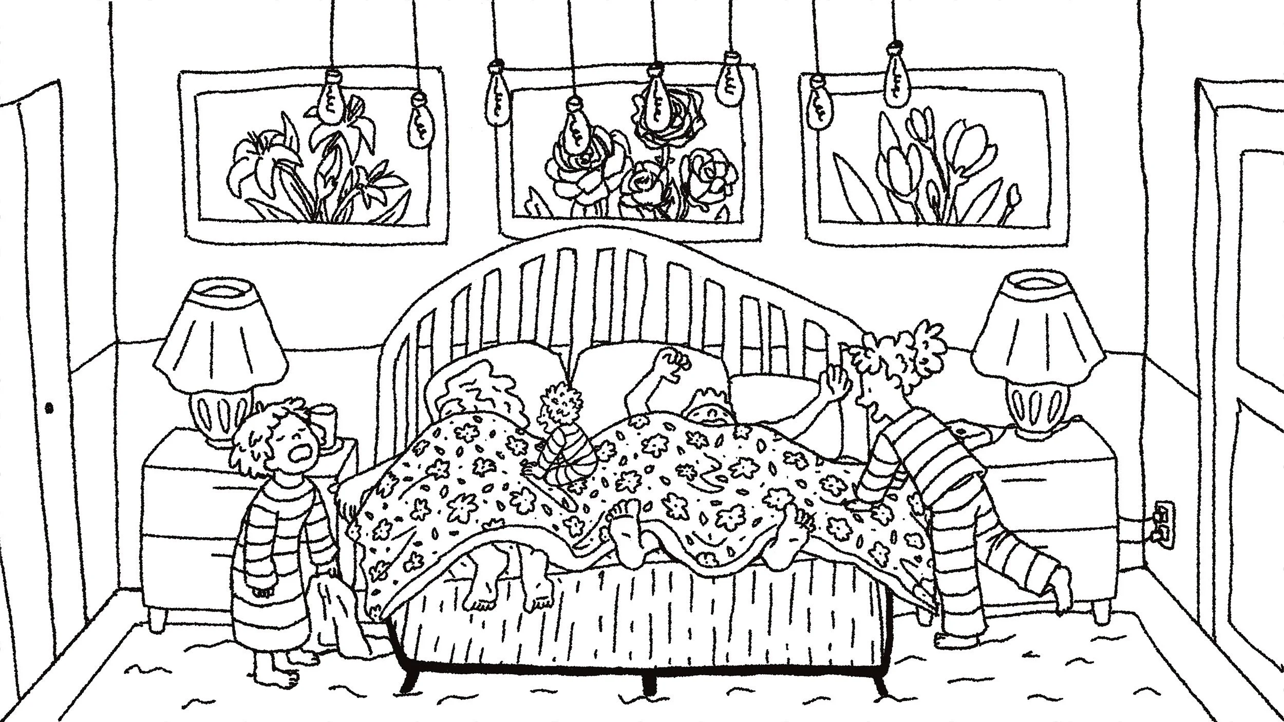
Not all of parenting is joy so here we see a scene that, as the youngest of four, my parents had to endure a lot. The kids are causing the Waldo chaos in this one more than the patterns or decor.
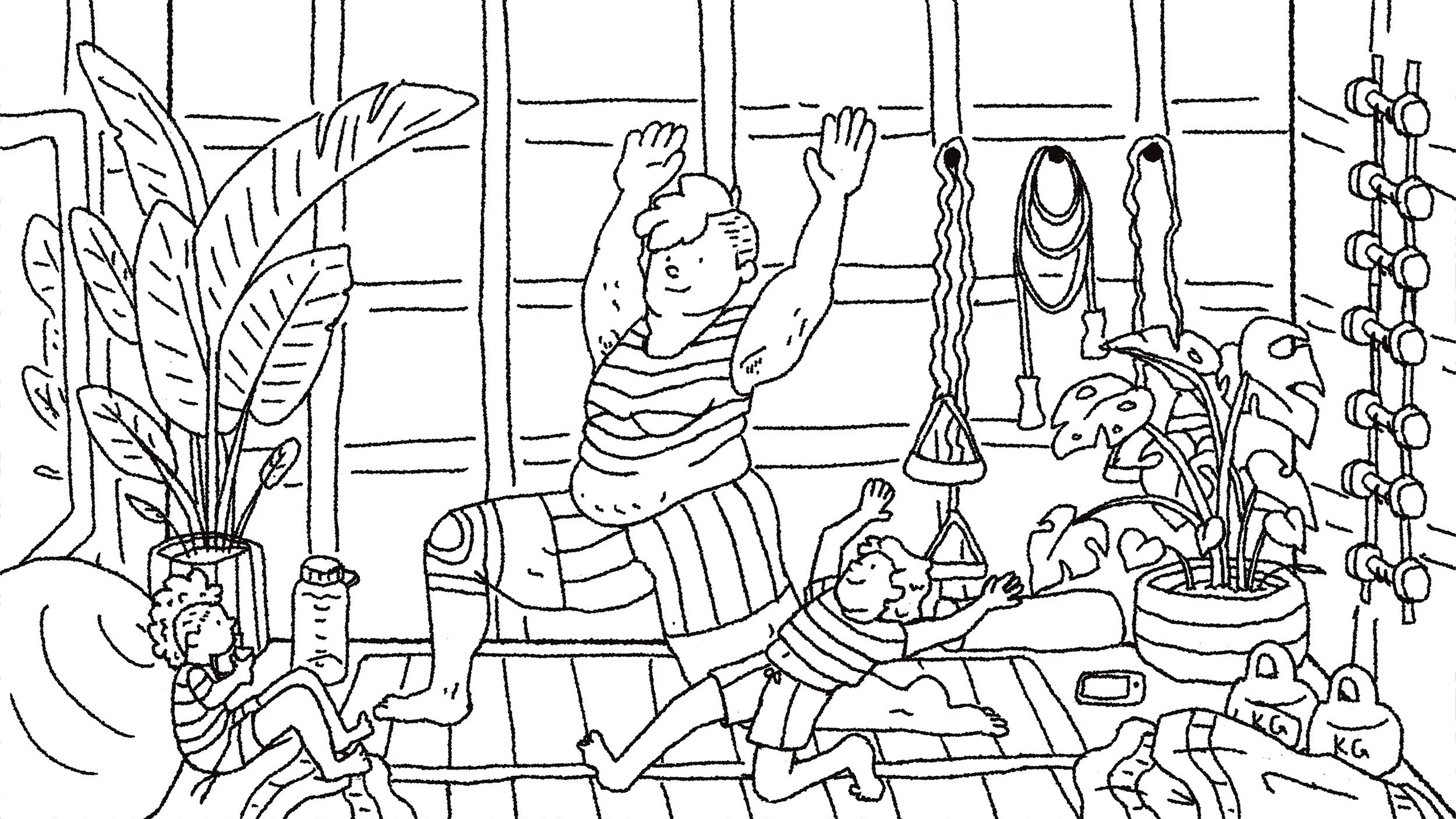
Physical fitness is an important part of everyone’s health but it’s extra important to engrain it into a habit with kids. The parent is not the typical fitness body type and I think that’s also crucial to displaying true inclusivity. Someone’s body type isn’t always an indicator of their fitness level.
It’s important to represent indigenous families in a project like this one. I wanted to show a modern and maybe more subtle take on their culture so I nodded to medicine wheel colours in the curtain and showcased a baby wrap carrier as well as bannock for breakfast!
This sweet family might be the most Waldo of the whole bunch! I used the classic glasses on the mom and the little girl blends in more than anyone else on that striped couch.
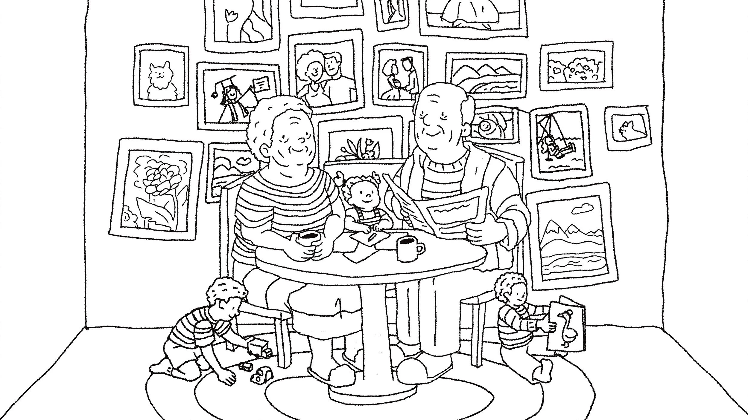
This sweet scene with interracial and intergenerational characters was a joy to make. I got to create a backstory for the grandparents in the pictures behind them which most viewers won’t n0tice but it made my job more enjoyable.
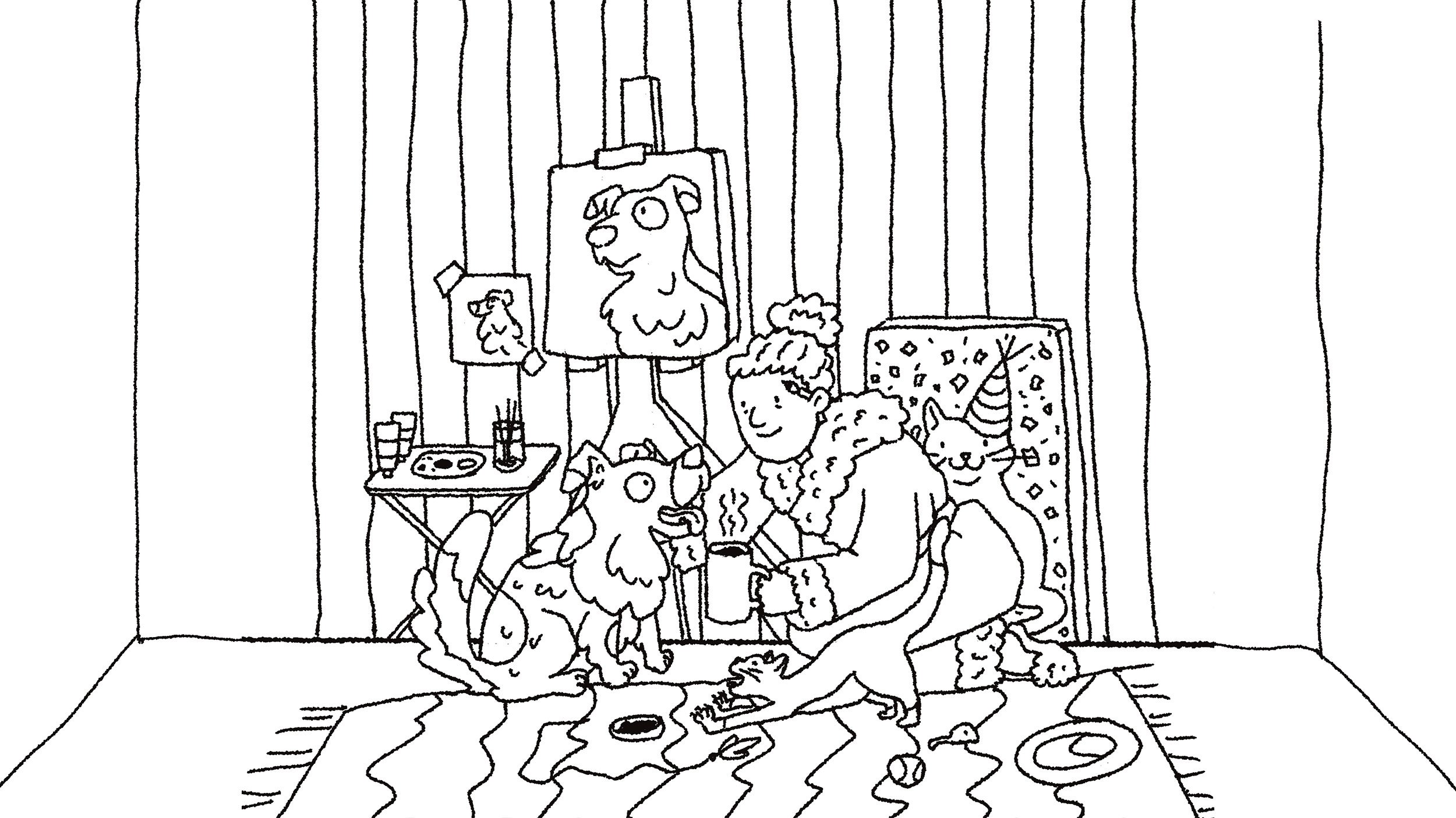
While the main story of the project is parenting, we wanted to make the vingettes as inclusive as possible which included single people and pet parents!
There was one more squuare that needed to be filled and we didn’t have a lot of single people in the composition at that point so, like the painter, I added a solo man. It allowed for a goofy situation that added a bit of texture to the otherwise kid-focused layout.
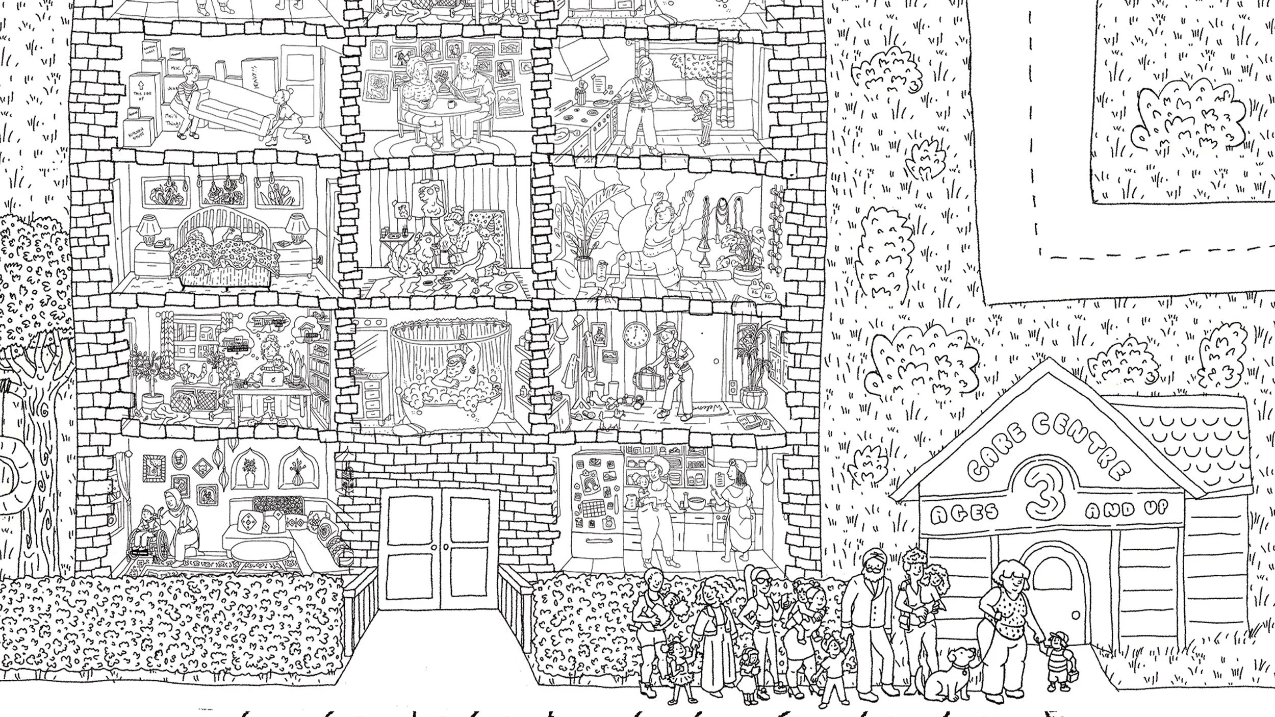
The lineup for the daycare was a great opportunity for me to touch on any skin types or body types that were lacking in the main compositions. It was a joy to find ways to express the child and parent relationships in this simple setting.
The video needed cover art and end slate art so we chose a couple of cute kids. The sign being held at the start is a nod to the Where’s Waldo book covers.

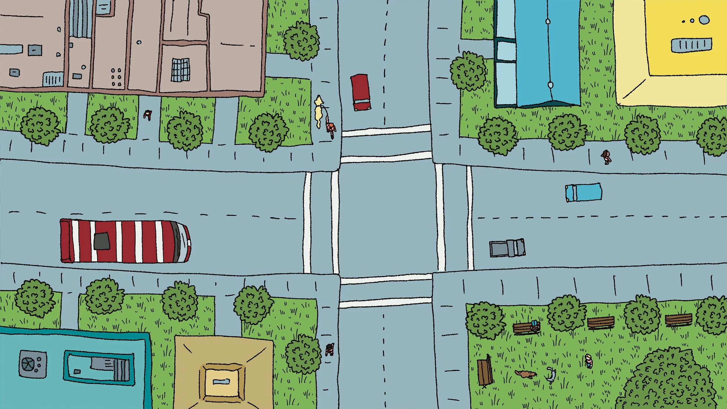
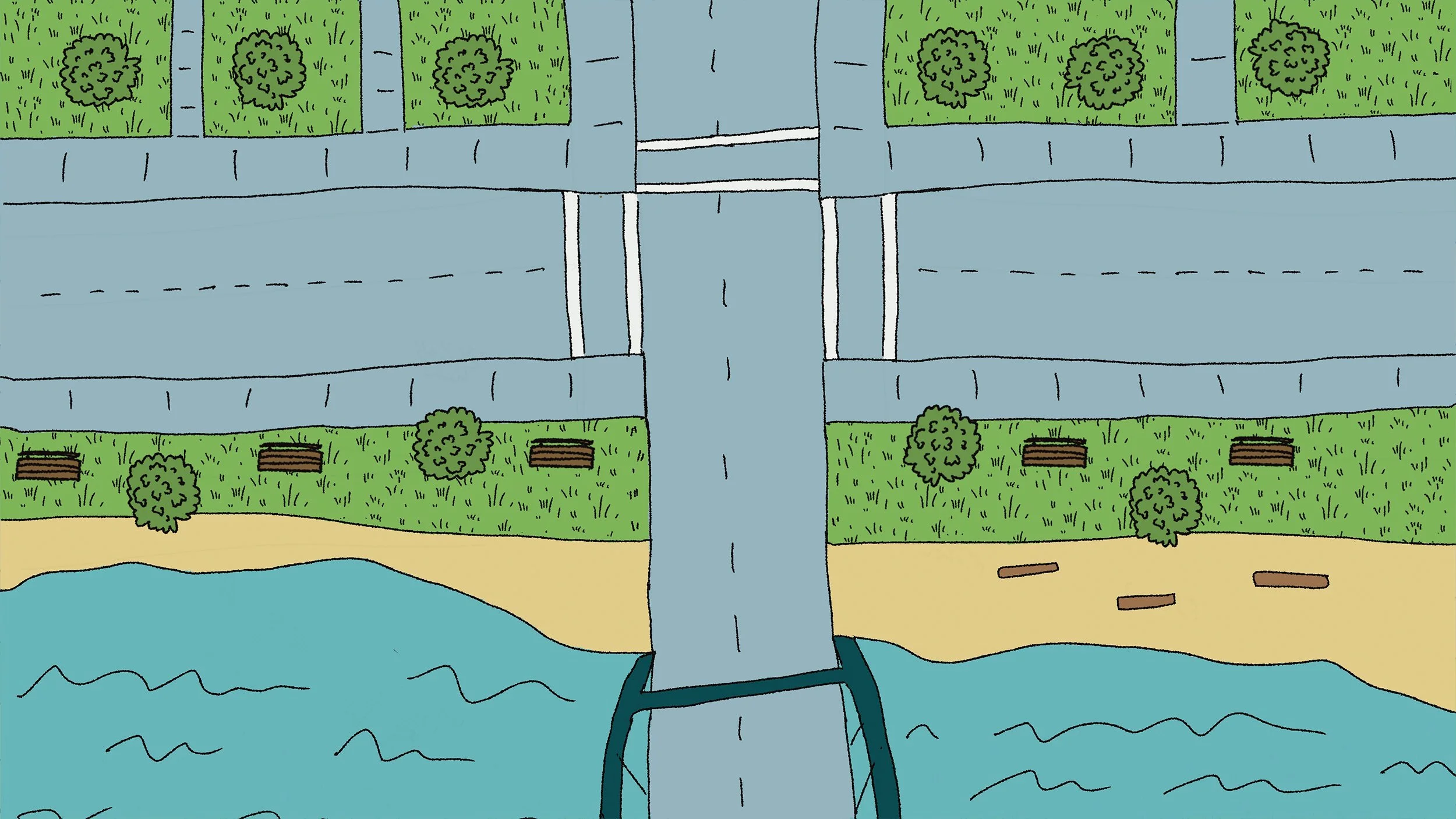
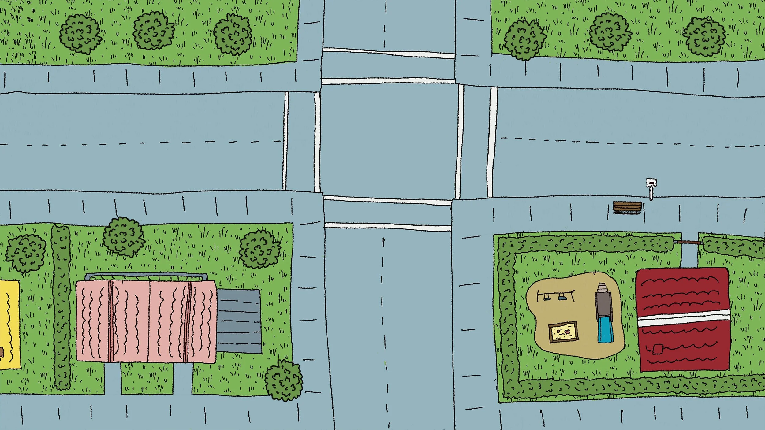
Road illustrations

Sketches


