Red Rooster Wines
Illustrations that bring a contemporary art-heavy style to an otherwise standard label.
Role
Illustrator
Agency
Brandever
Client
Andrew Peller Ltd.
Date
August 2016

Red Rooster has some of BC’s best wines and needed a label that matched what they contained. They also wanted to appeal to a younger market by steering away from a sanitary landscape style label.*
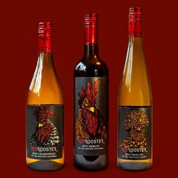
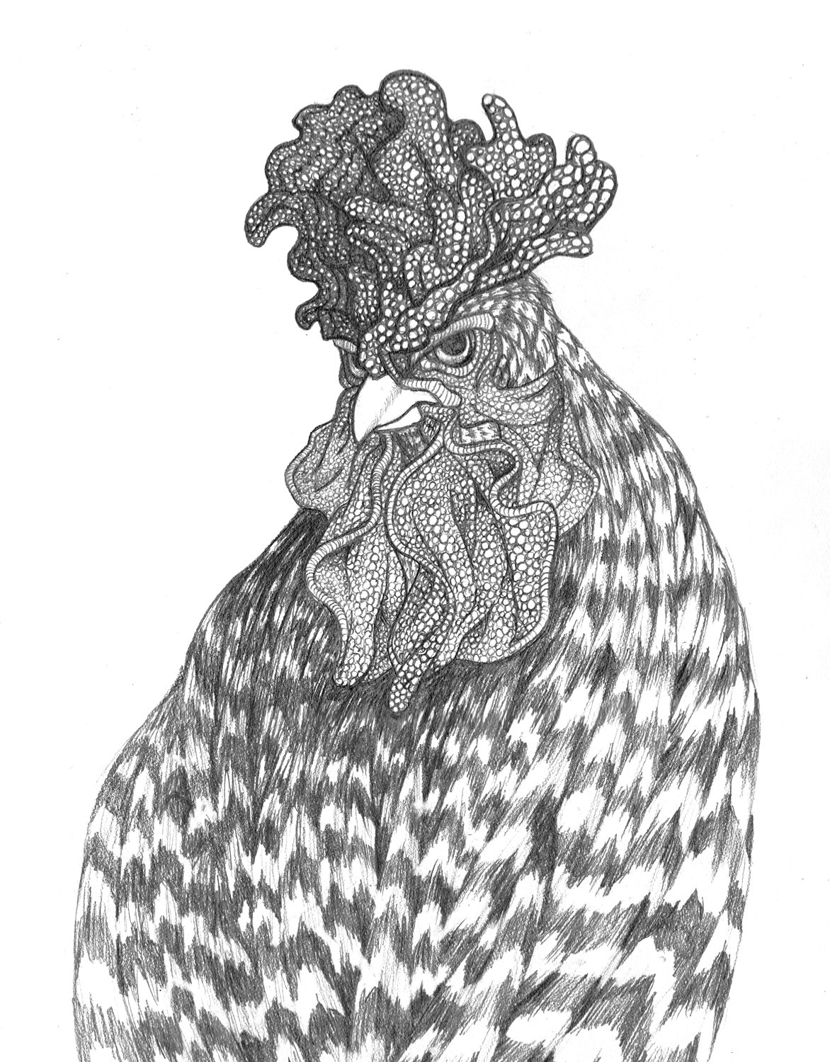
Pairing traditional pen and ink drawings with digital painting, art director Emily Pedriks and I created a series of brazen birds to do just that. These roosters stare you down and flaunt their feathers with their unique identities and style. Finally, Red Rooster has the bold personality it deserves.
*2023 update: they ended up reverting to a landscape label so I guess the older generation still has more money to spend on wine than Millennials and Gen Zs. The roosters had a good run.


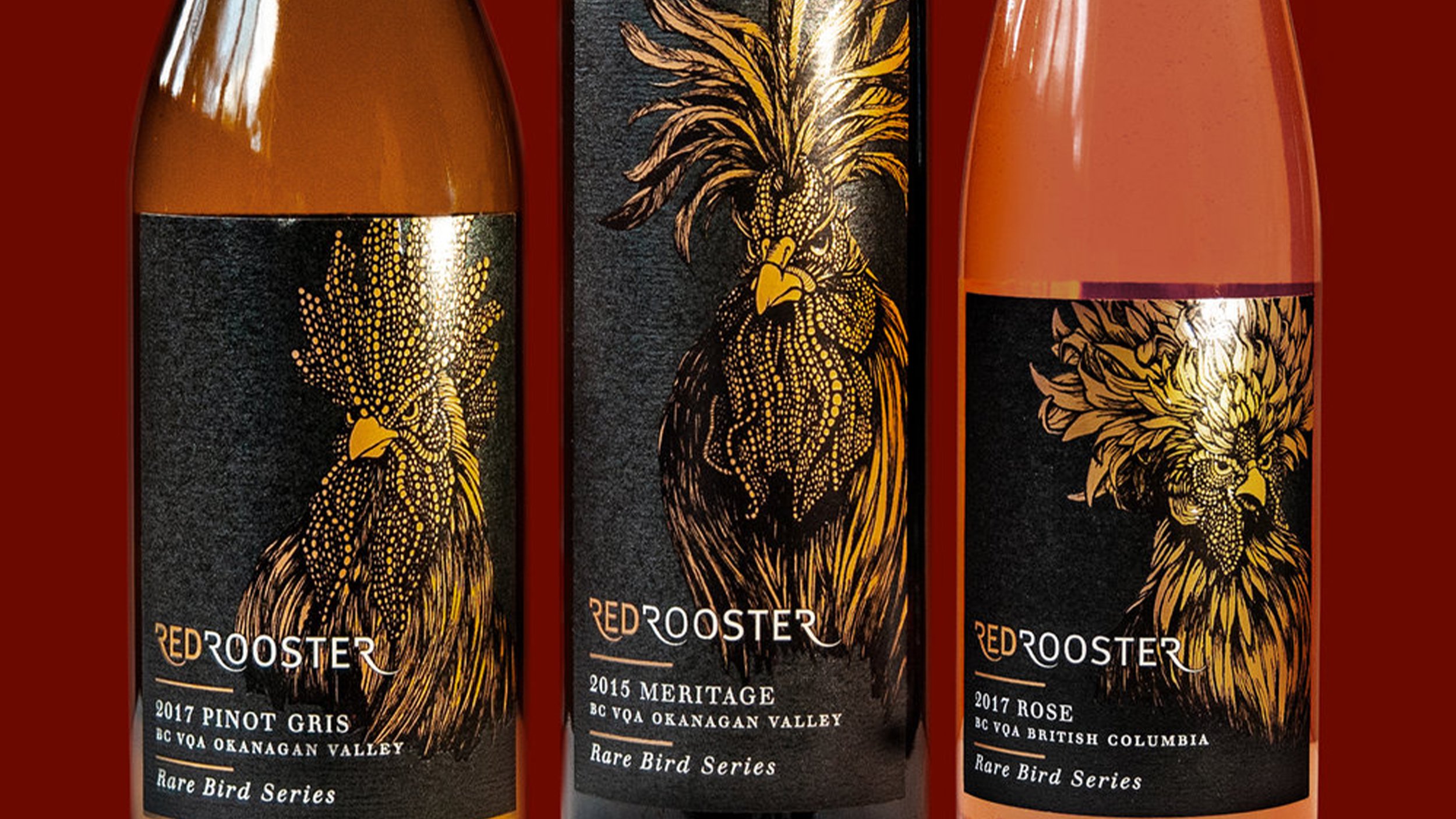
The three digitally printed rooster illustrations needed to represent their individual breeds accurately while also differentiating each wine varietal on the shelves. The ornate crests of the birds serve to separate the roosters as well as bring depth and drama to the labels.
The Rare Bird Series received a gold foil treatment to stand out on collectors’ shelves. This removed some of the dimensionality that you see in the digitally printed labels but added a luxurious and exclusive look and feel. These can only be purchased directly from their winery.

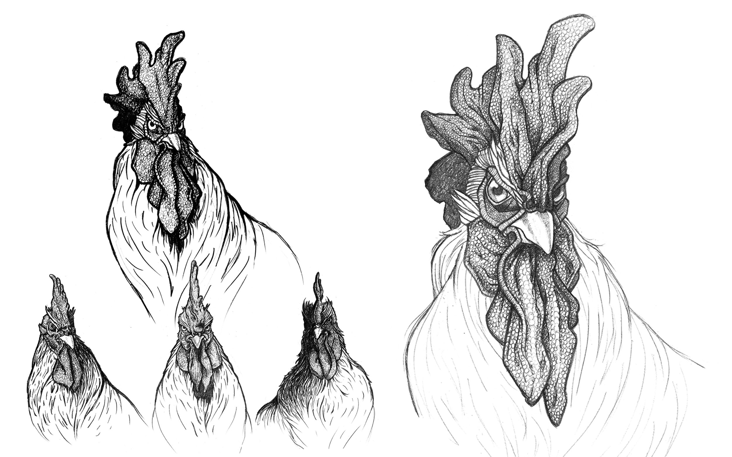
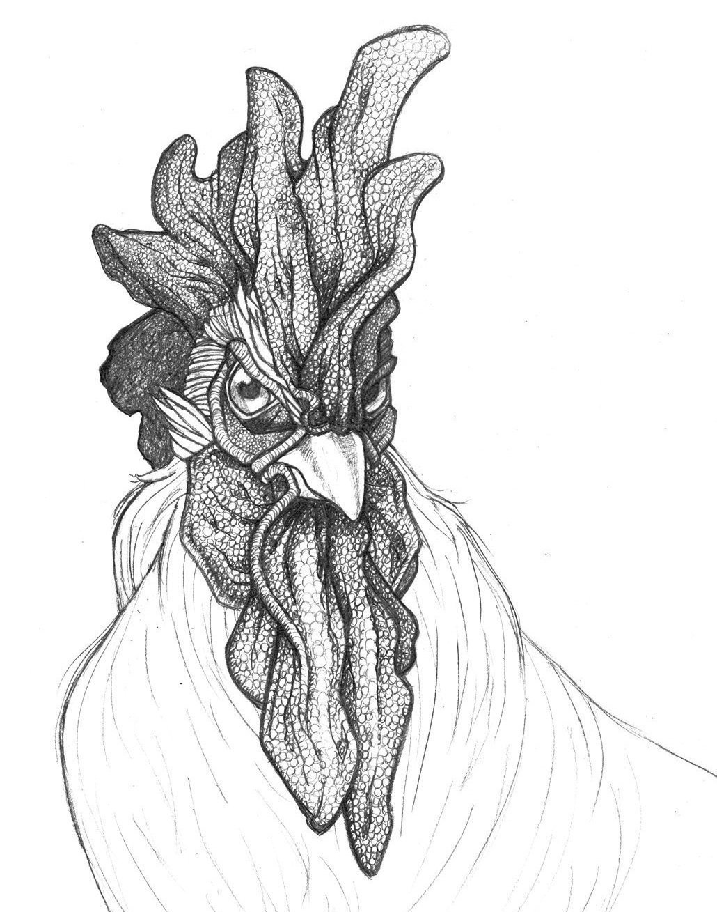
The sketch process was intricate but necessary in order to convey each rooster’s breed attributes and emotions. It started with compositional sketches that were simple in detail and focused on angles and mood. After that was decided, the next step was tight detailed sketches. The folds and feathers needed to work around the design aspects and label sizes so a tight sketch allowed for a proper in-situ test as well.


