Vancouver Chamber Choir
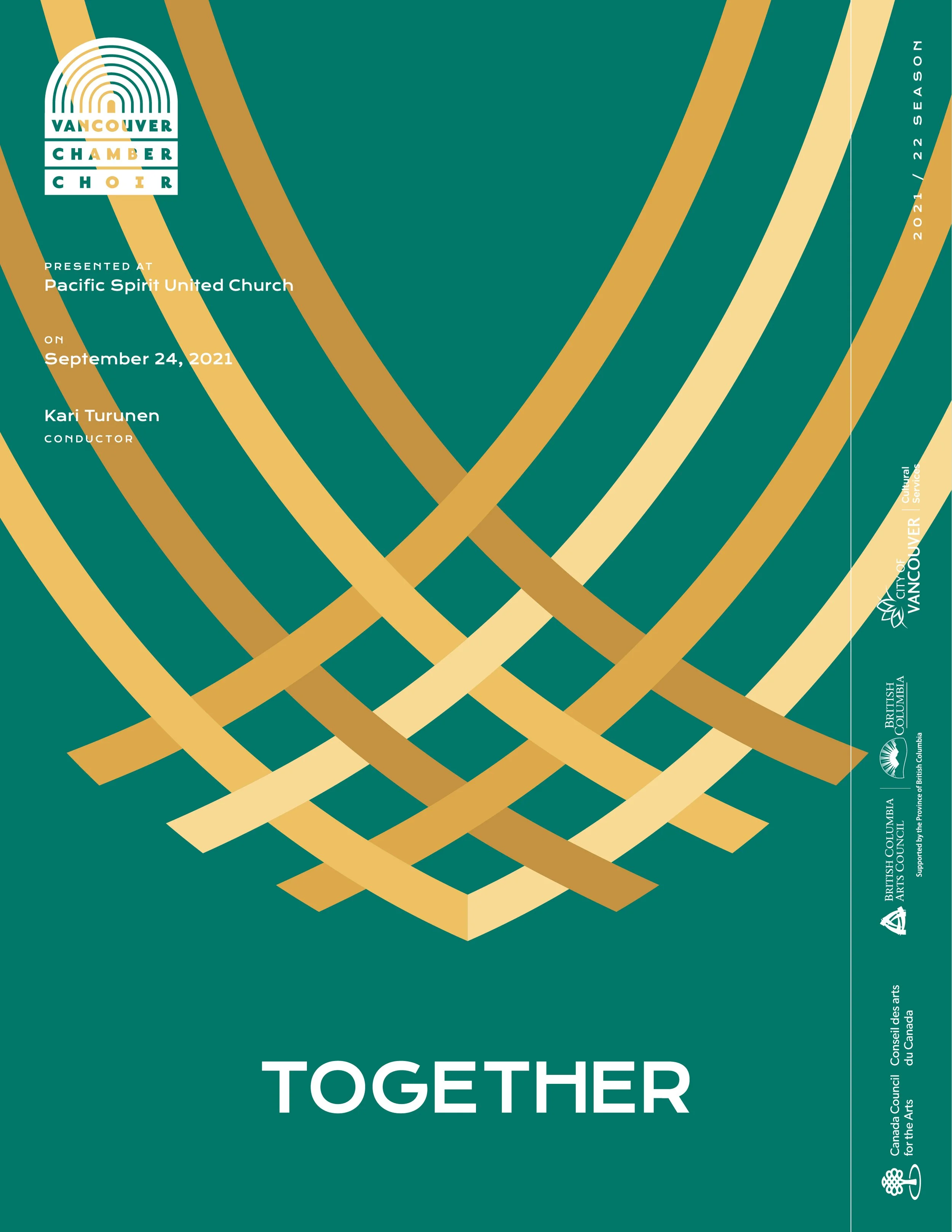
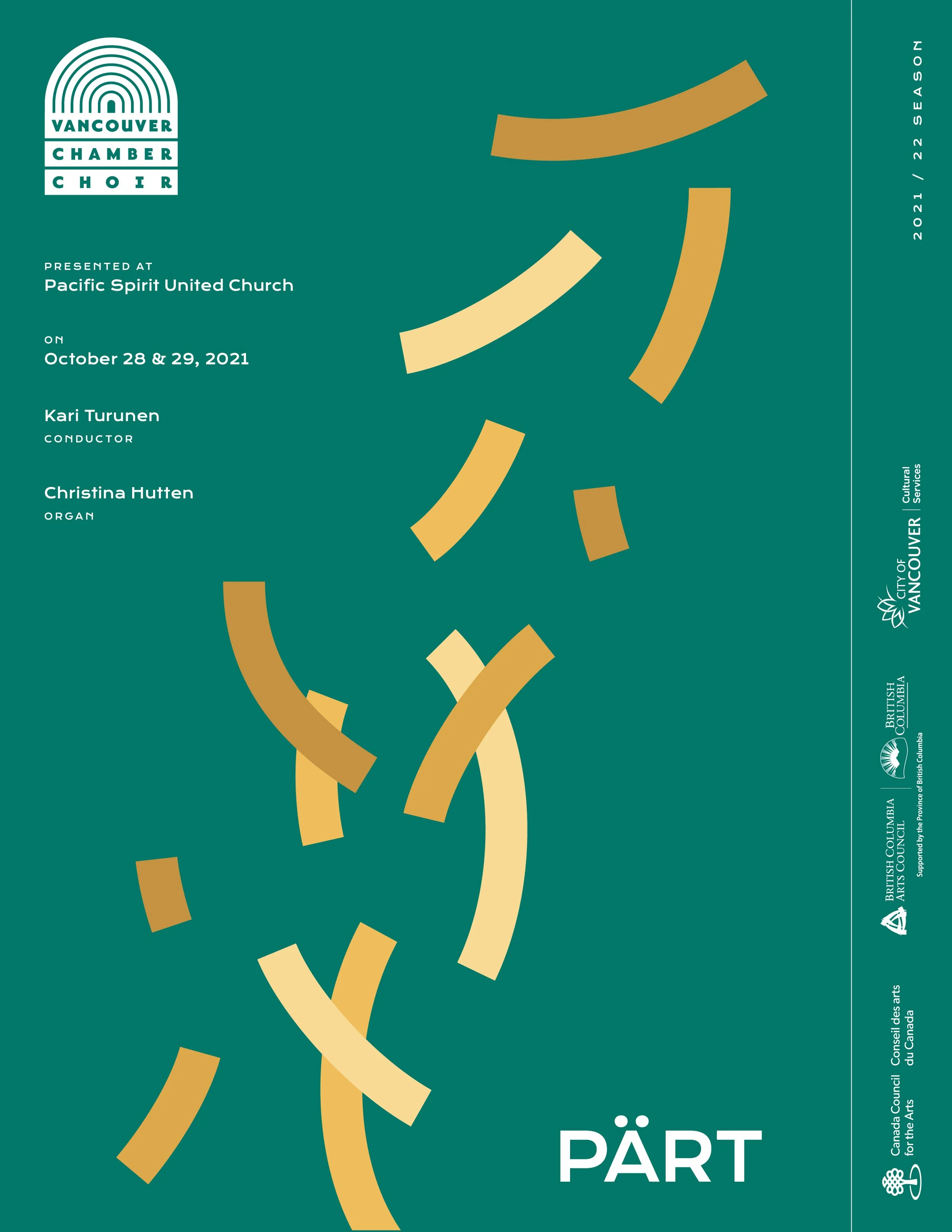
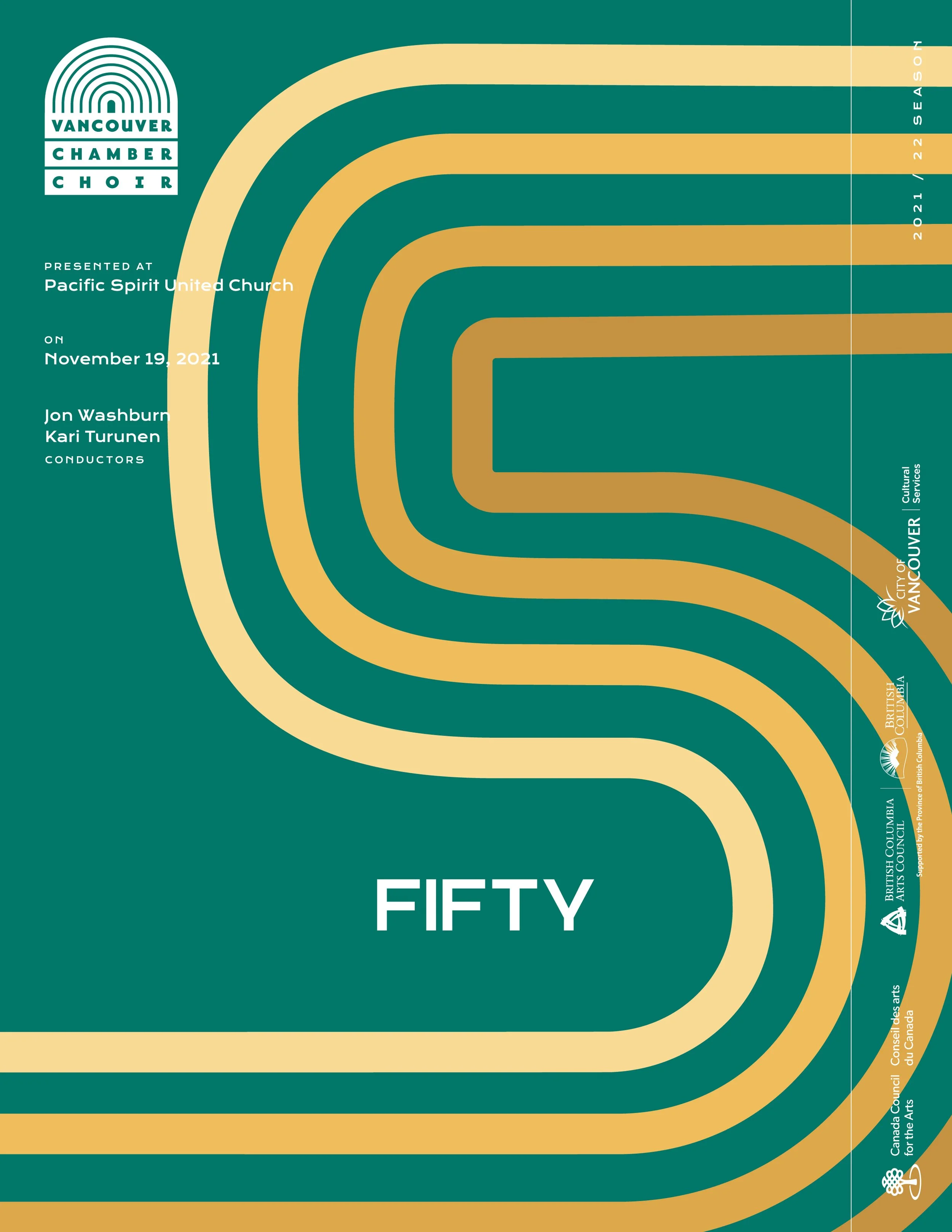
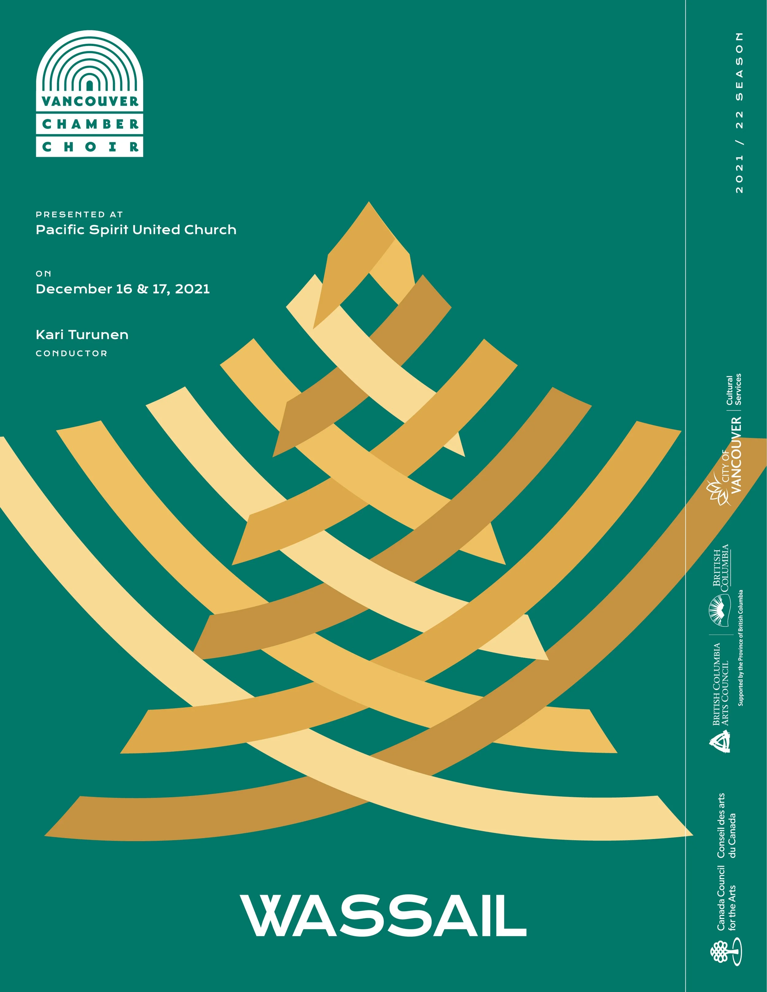
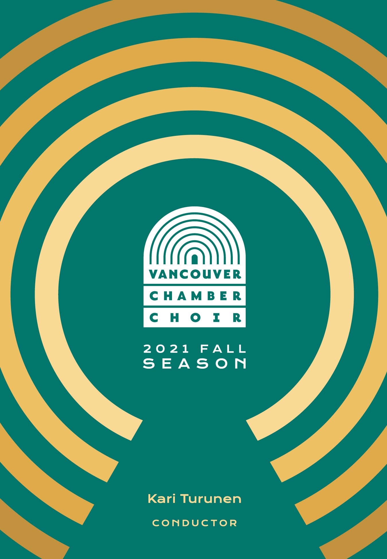
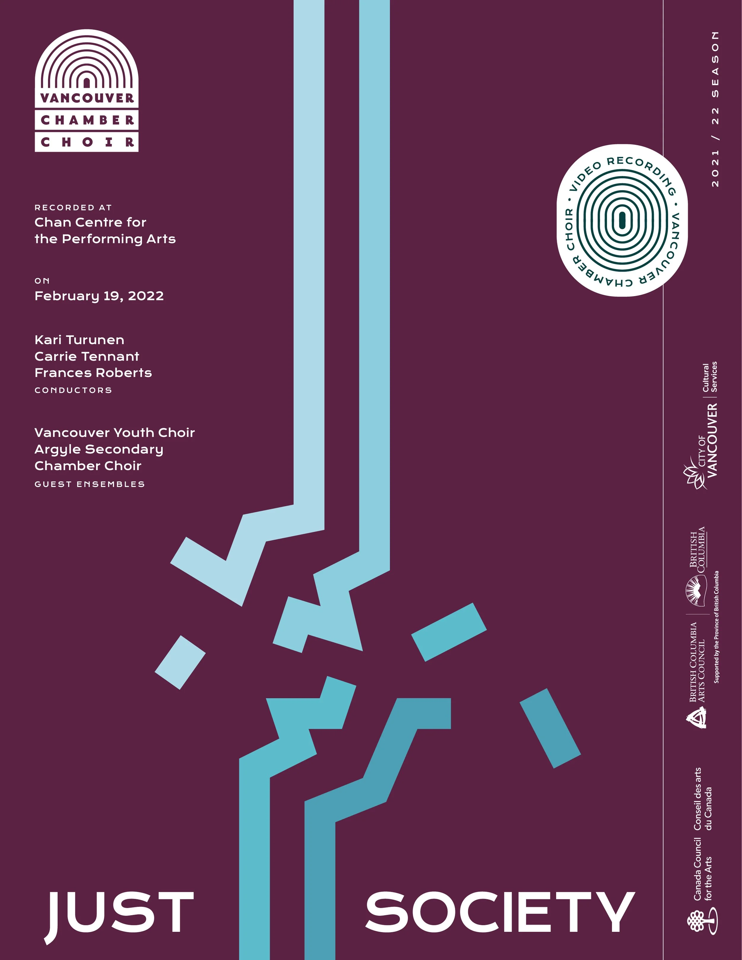
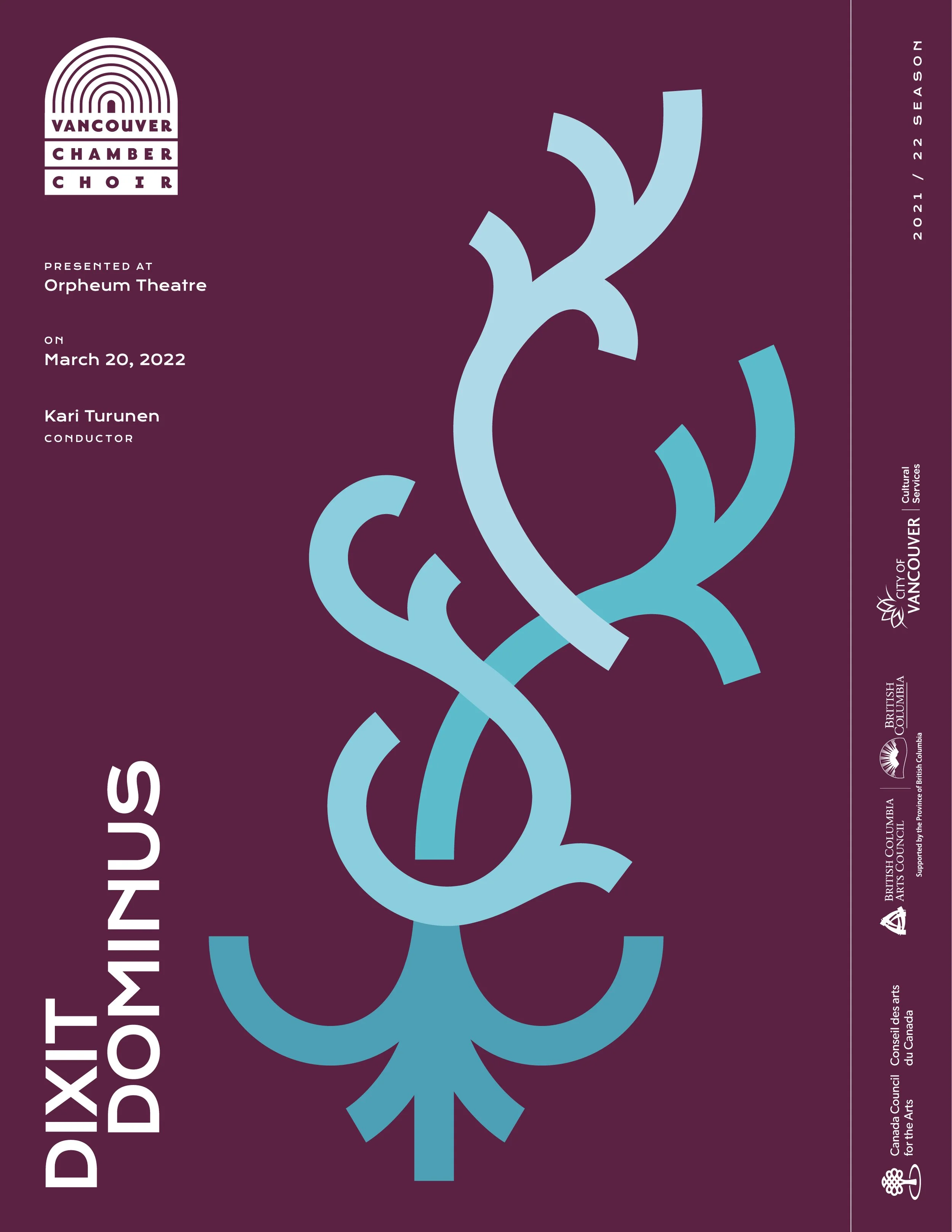
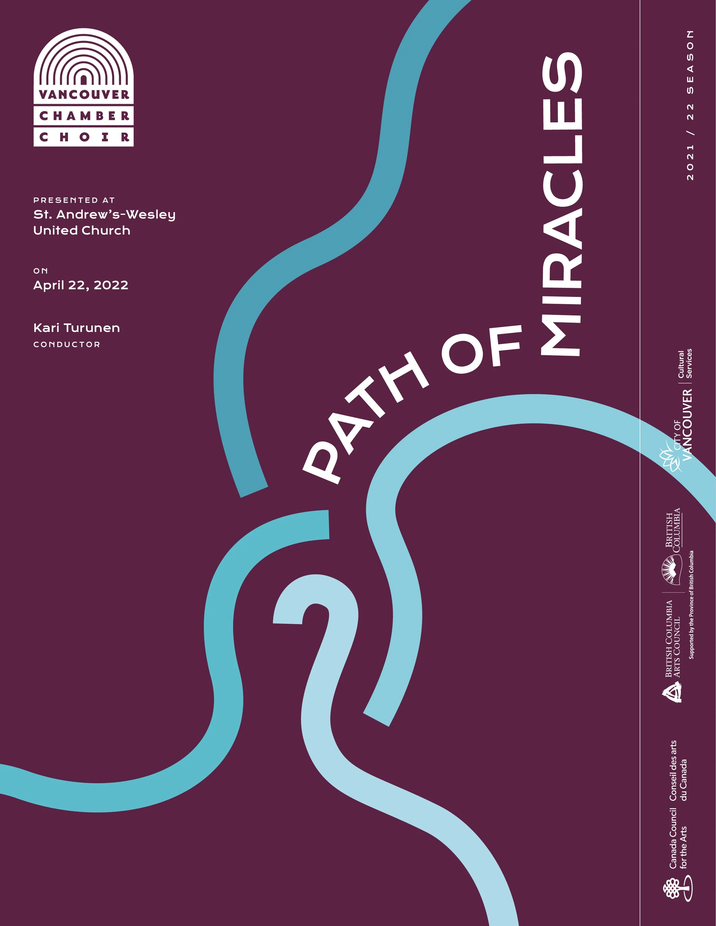
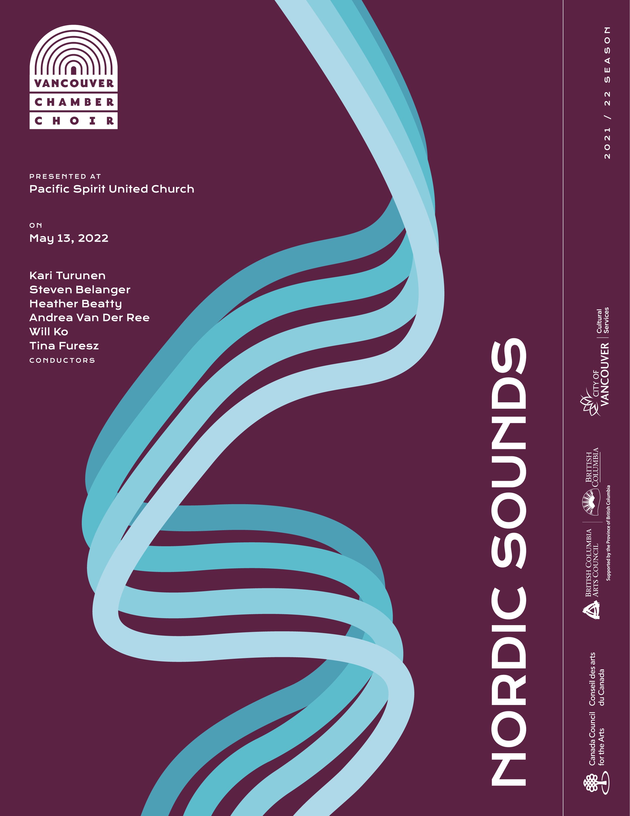
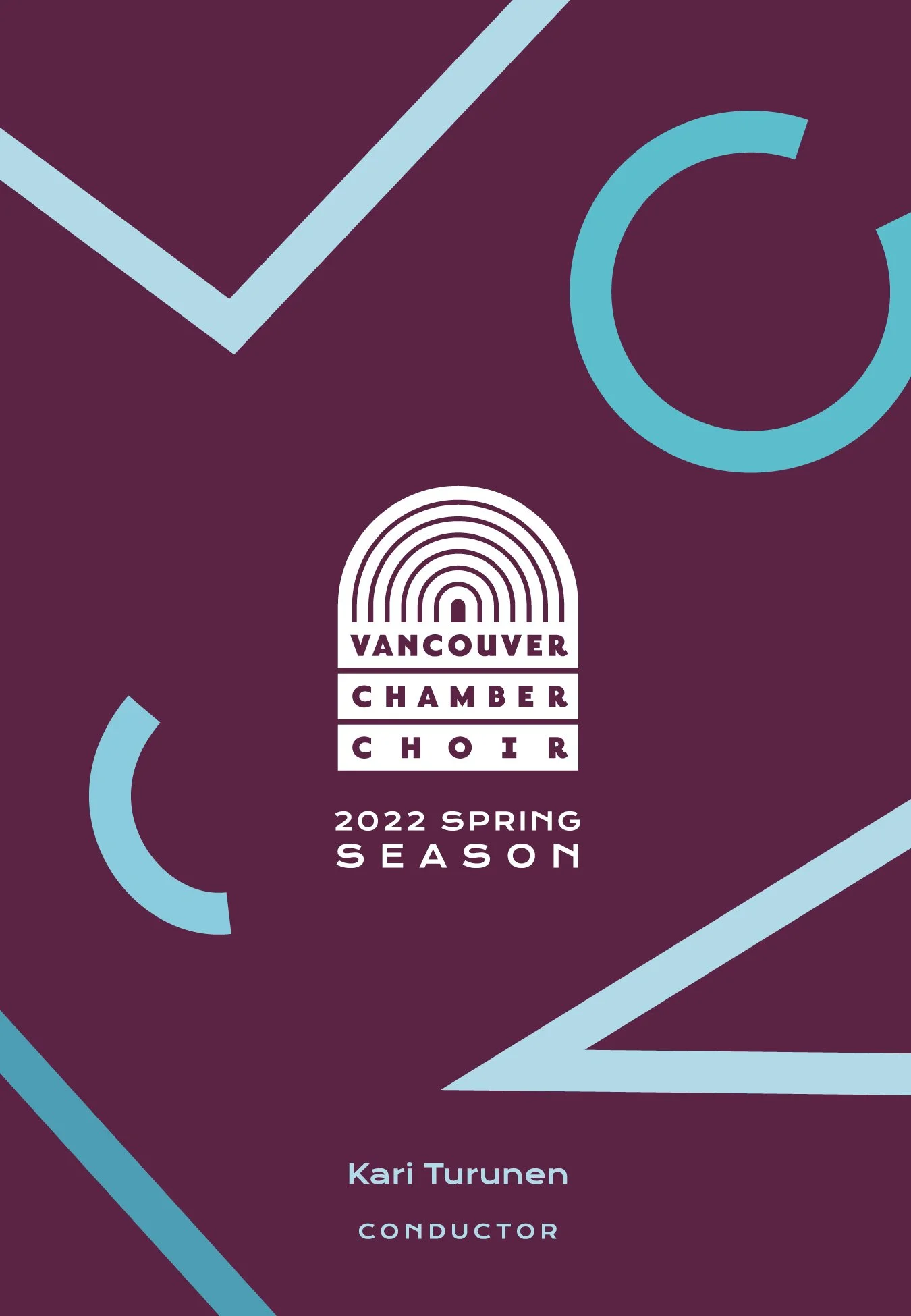
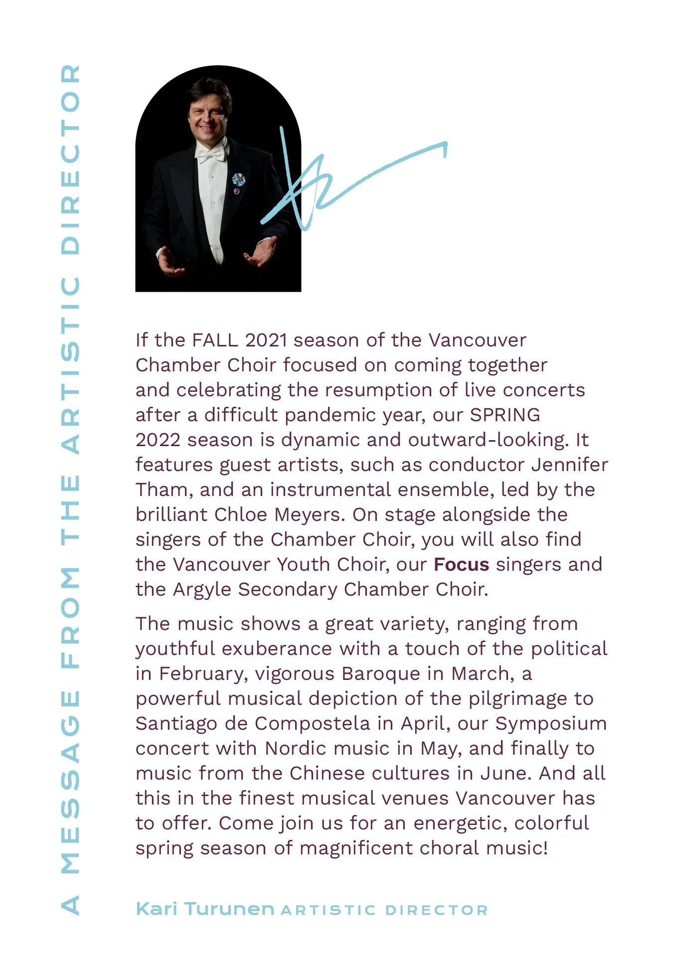
The 2021/22 concert playbills for the choir needed a fresh new look that could carry over their two-part season cohesively.
Role
Visual Designer
Animator
Agency
OK Dave
Client
Vancouver Chamber Choir
Date
January 2021

THE PROBLEM
Every concert season needs to look distinct from the last. They also need to feel related to the concerts like an extension of the musical art form on paper. How do you keep the seasons looking fresh and unique while also keeping things within the feel of the brand?
THE SOLUTION
Find a way to tie in the previous season’s creative to make the change smoother while also making the creative distinct and memorable. Listen to the pieces and get the perspective of the composers to make sure each playbill translates the music.

The Vancouver Chamber Choir is a non-profit collective that works hard to deliver beautiful choral sounds every year. To help their music reach as many ears as possible, we created a set of playbills and other materials to promote their annual seasons.
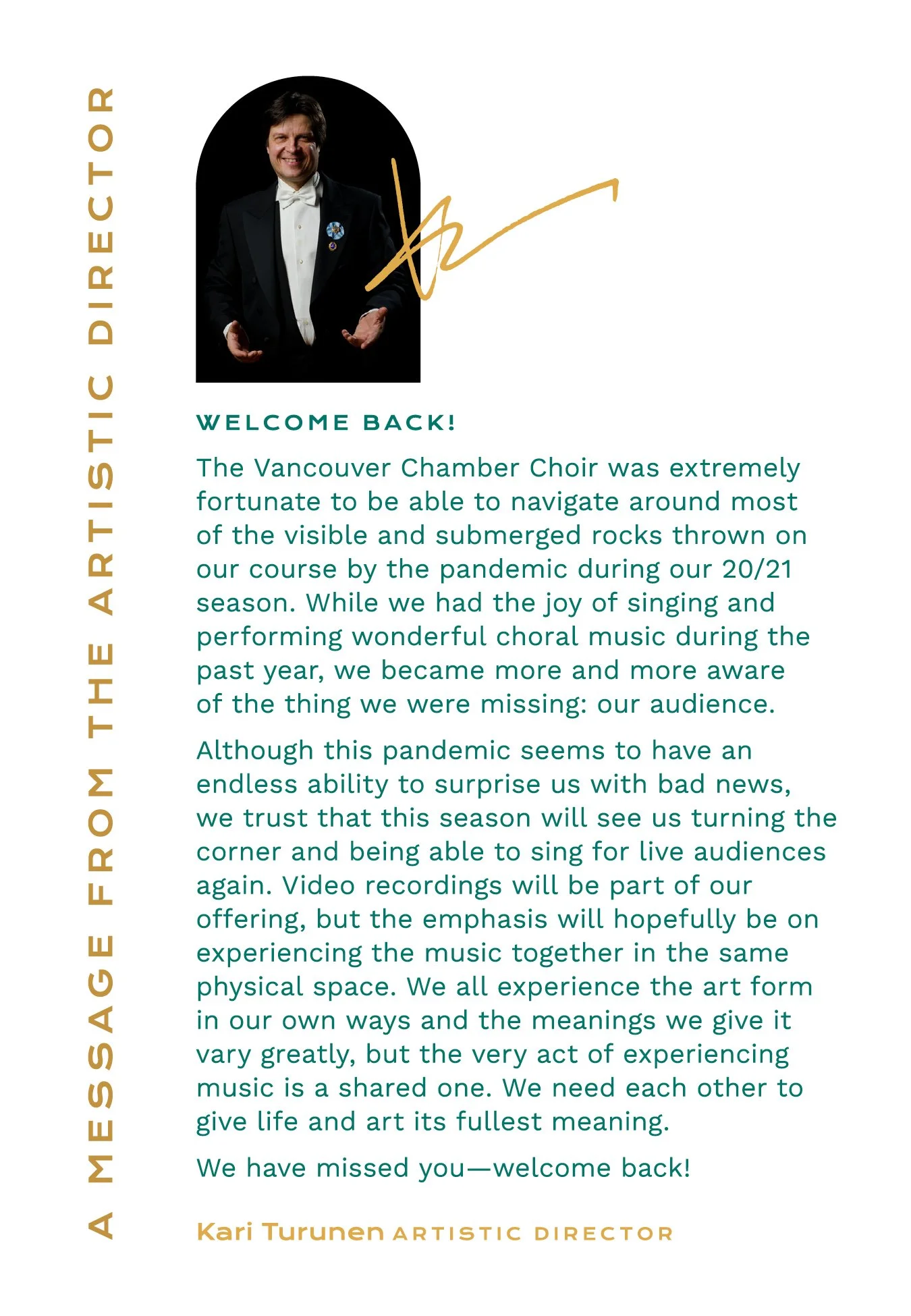
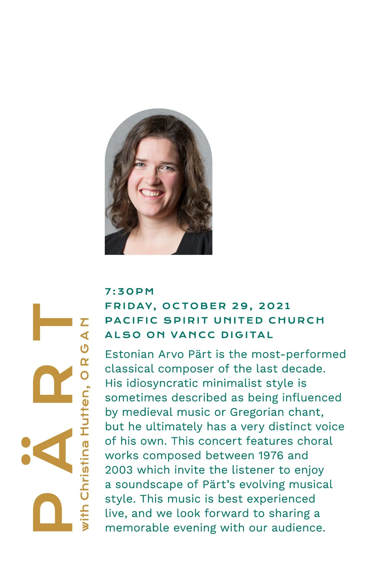
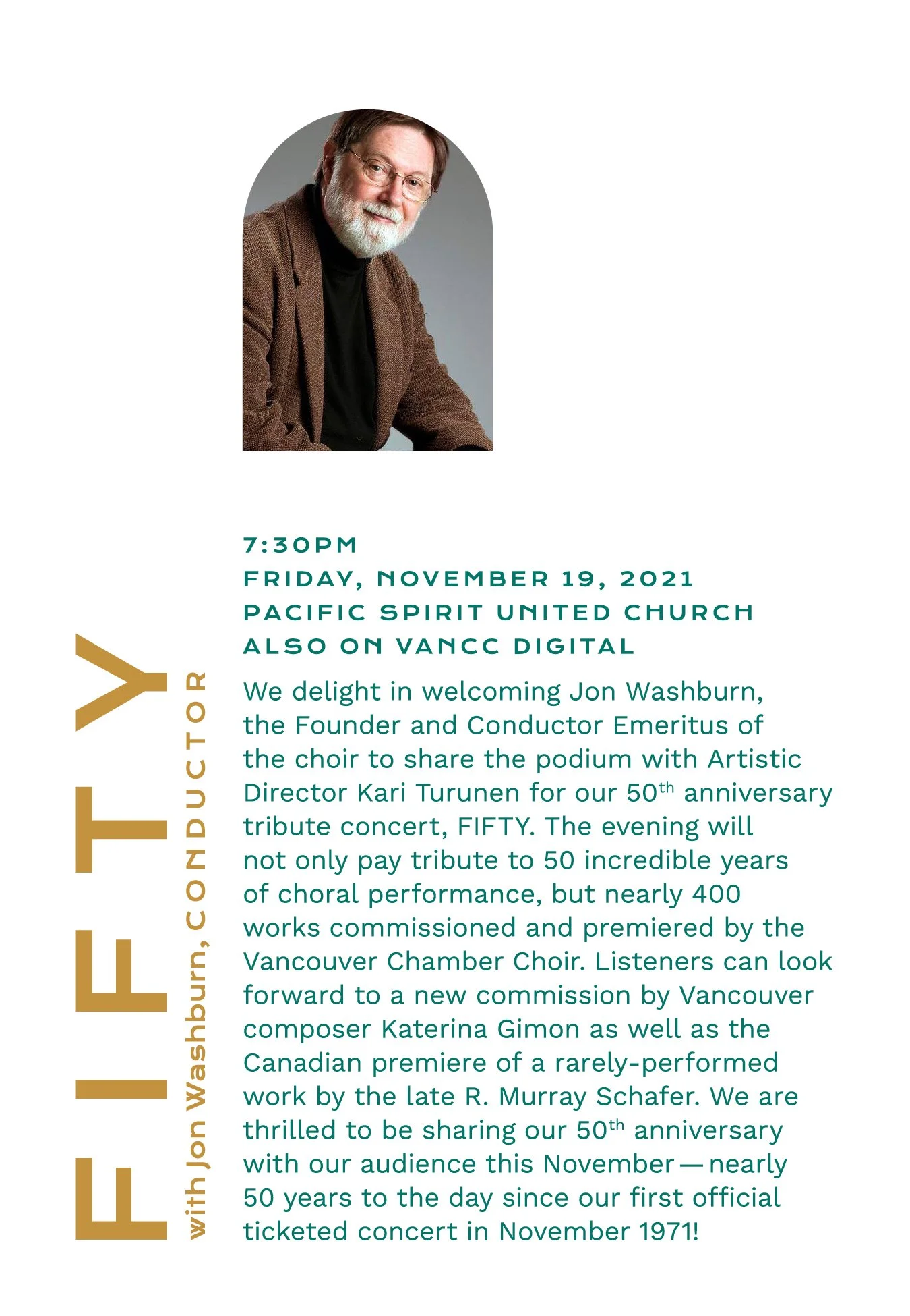
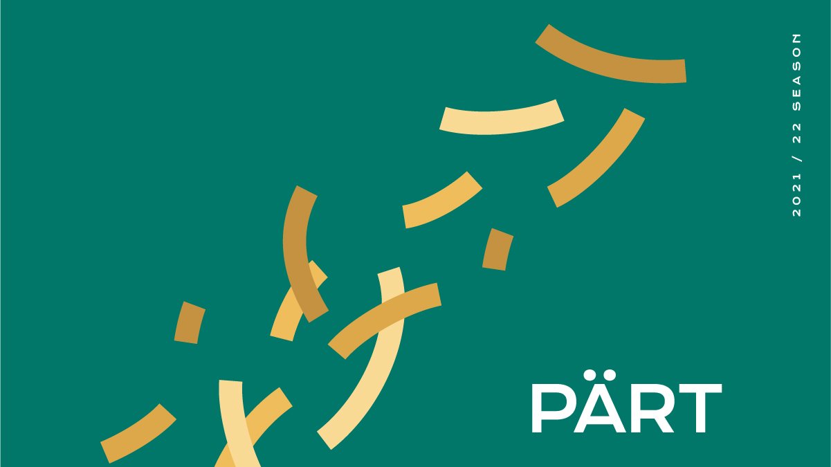
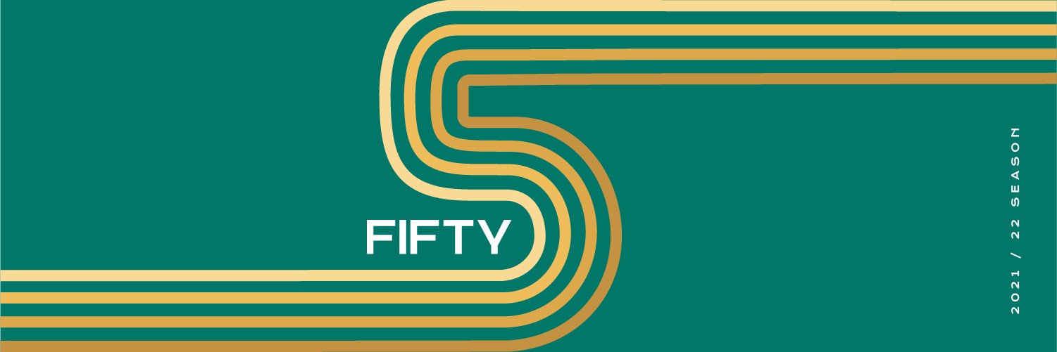
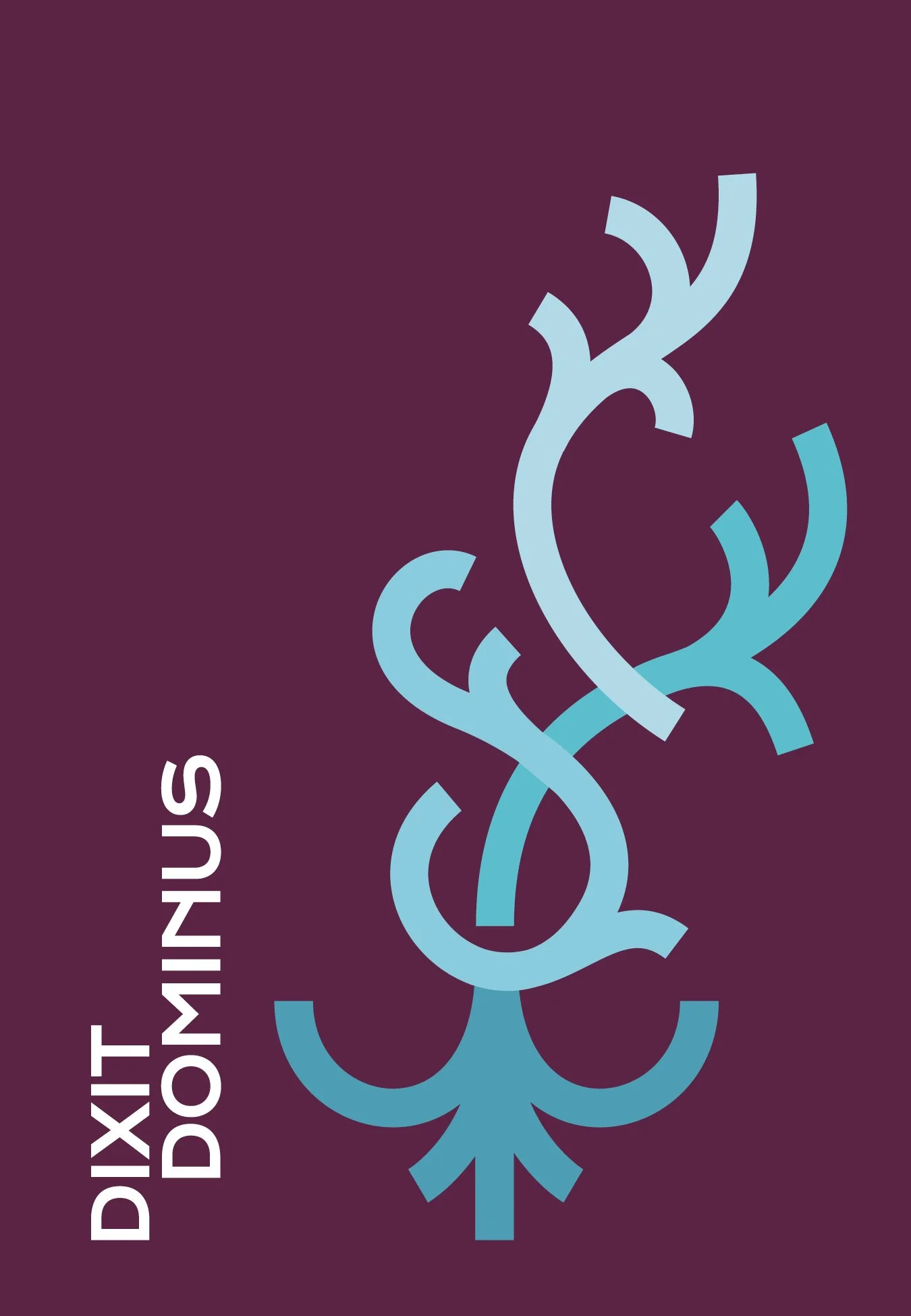
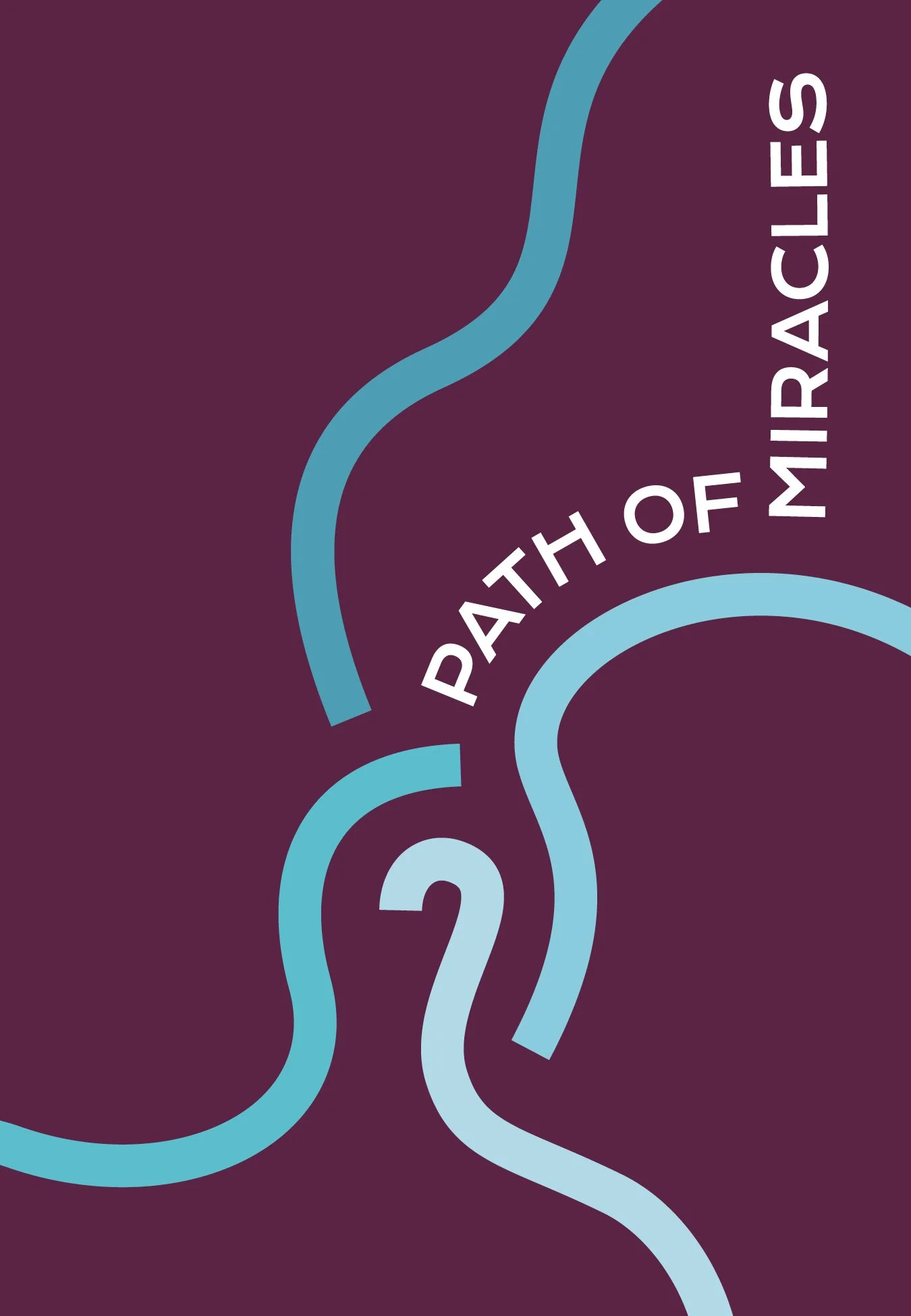
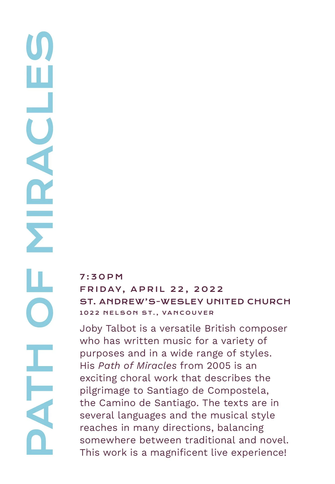
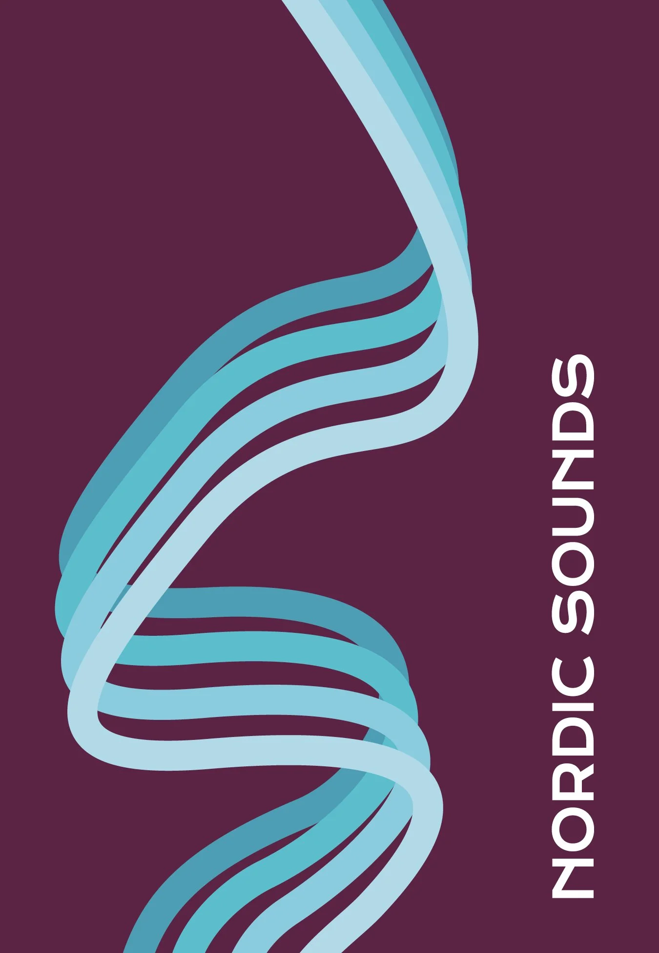
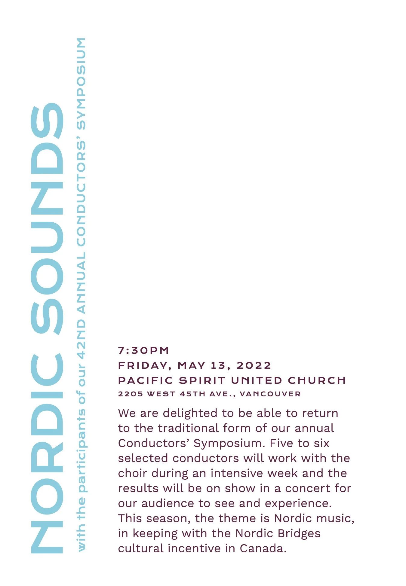
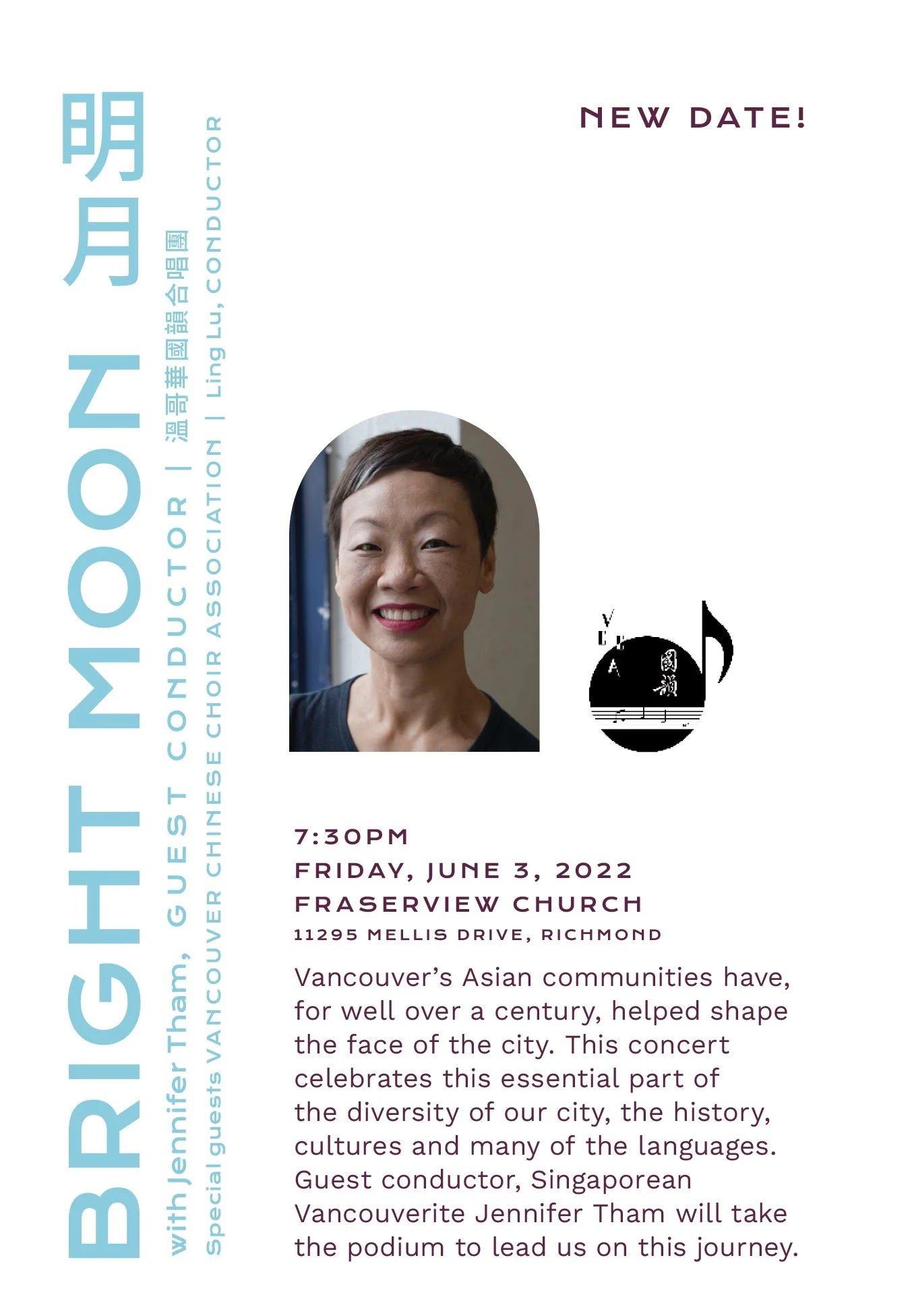
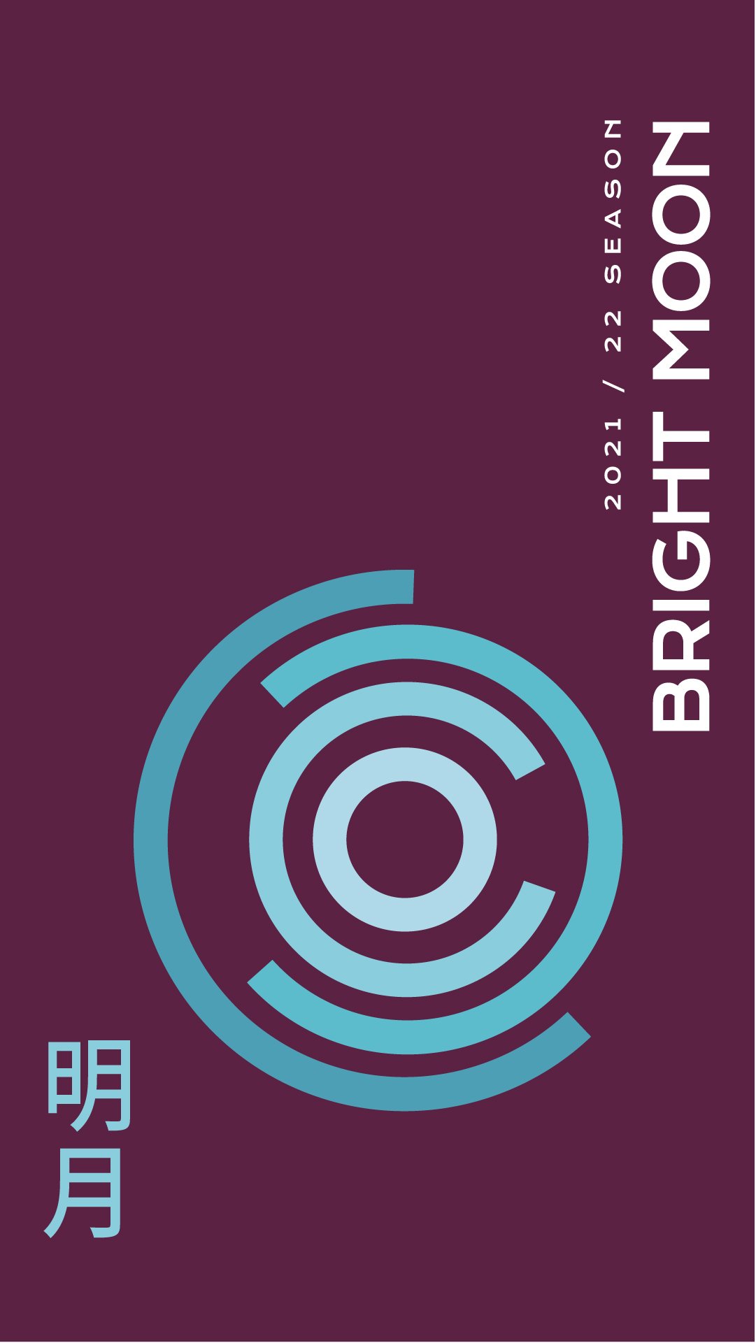
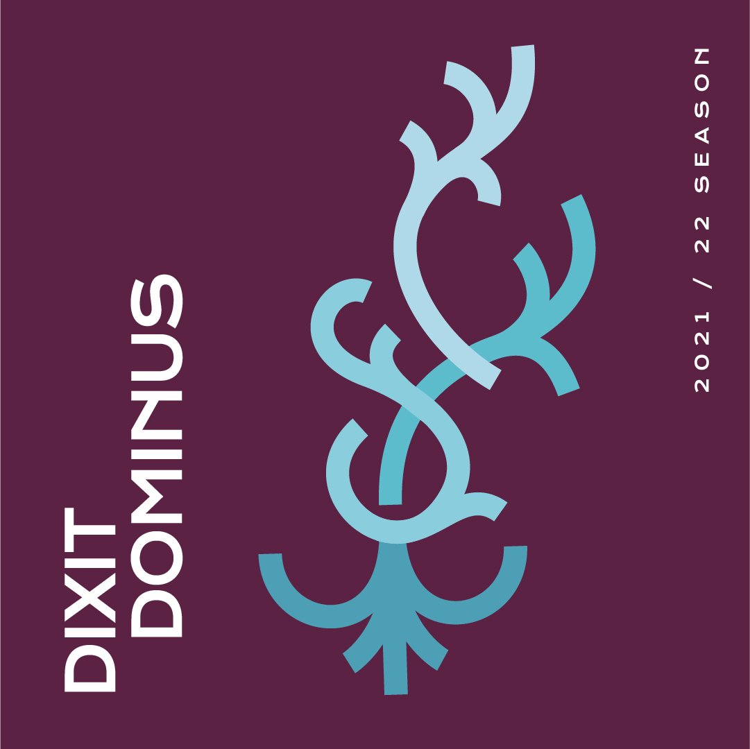
Each season should be distinct from the last with some element to ease them together. The previous look focused on a blue background with sets of orange fill overlays to communicate the concert themes. This season’s designs use sets of graphics as well but, instead of overlay fills, we shifted to bold line work to form abstract shapes that convey the essence of each show.
The biggest show for the first half of the season was the holiday show so we went with a calming green and shades of gold to bring a subtly festive vibe to the season. The second half of the season uses the same graphic devices but with a strong winter palette to keep it independent but not fully disconnected.
For the 2021 performances we also created animations that introduce recordings of their live performances. This was a result of the COVID-19 limitations on live performance that year.


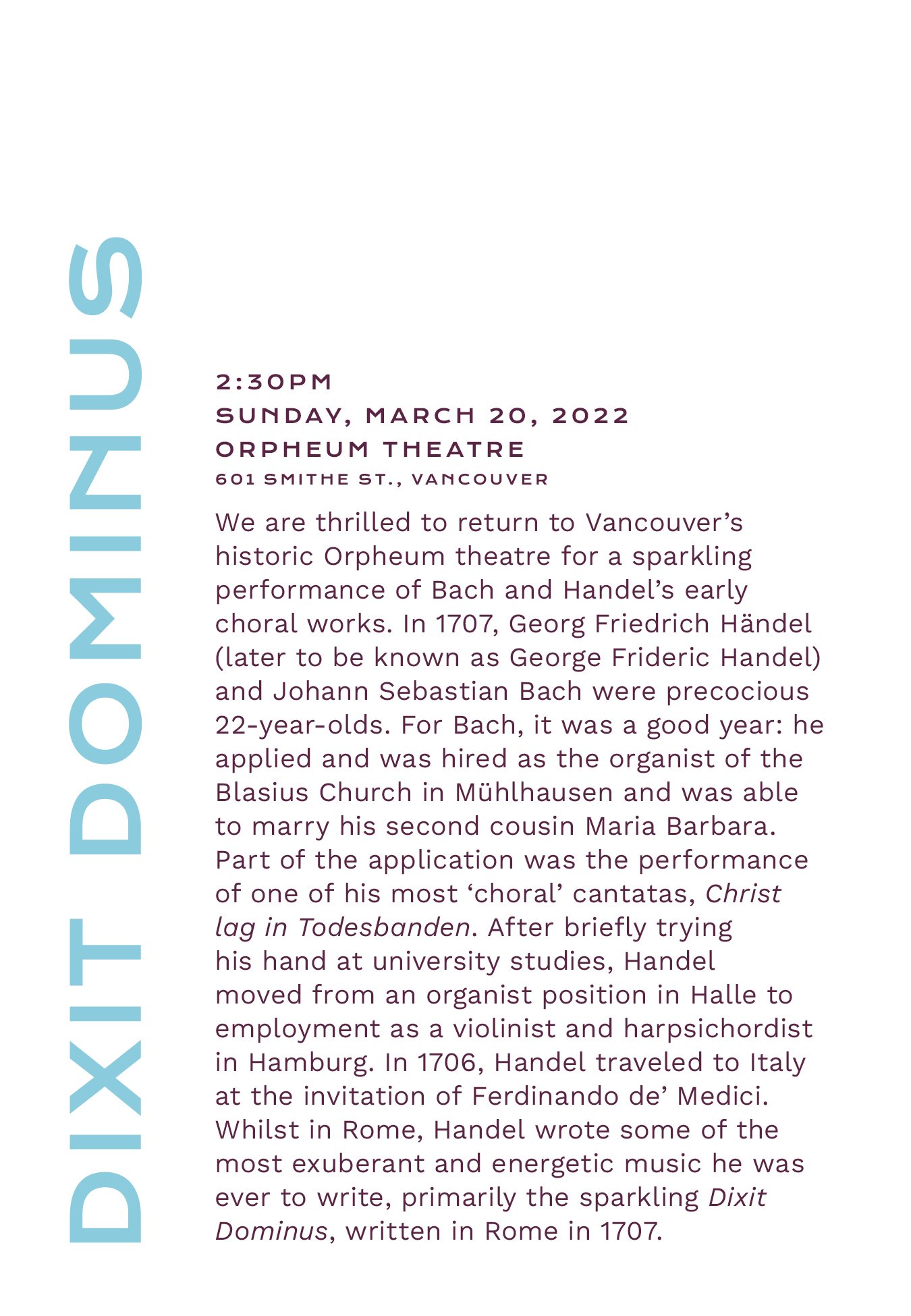
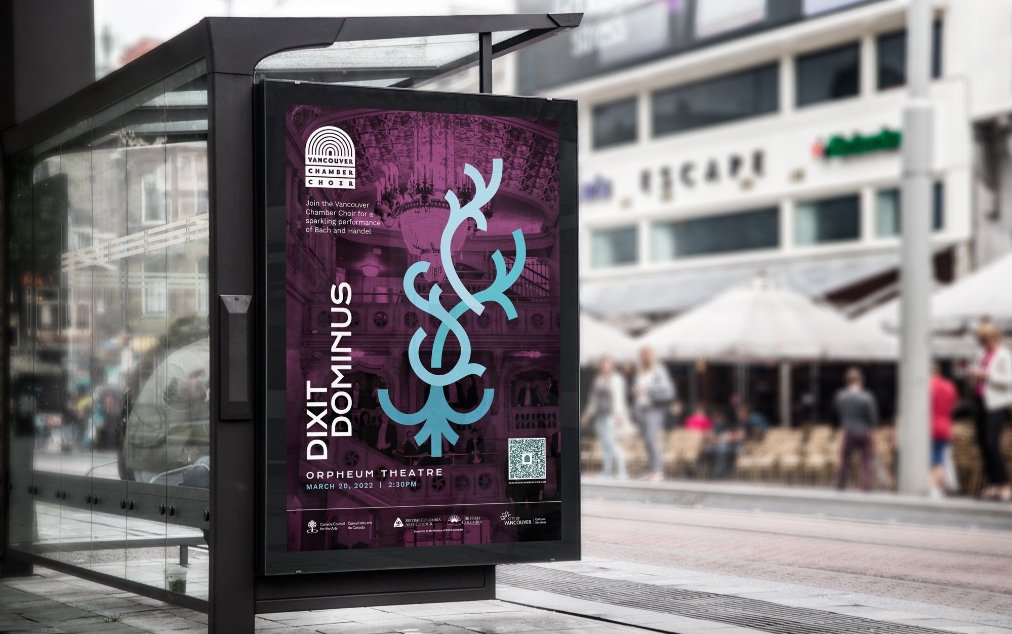
Dixit Dominus was performed at the Orpheum Theatre, a venue that the Vancouver Chamber Choir was proud to be in. We overlayed the concert design on a photo of the Orpheum to showcase the beautiful space and fill the seats. The purple tint was used to unify it with the playbill designs and provide contrast to the graphic and text. We incorporated a QR code for passers-by since COVID brought them into the mainstream.


Learning Outcomes
It’s rare that I get to work for other artists and it took me a moment to realize I was translating their artful interpretations not their business solutions. It felt more like a collaboration where we were making art together with two mediums. There were of course more practical design solutions like what the brochure and the ads would look like but the rest was a matter of emotion. Once that clicked, I approached the designs more like I would an acrylic canvas, looking for the sweeping motions and impact. This made the next set of playbills that we made for them much more simple to create.

